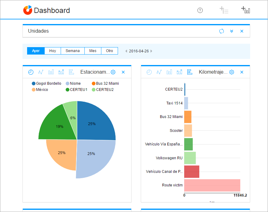
After clicking OK, the chart is displayed in the workplace. You can add any number of charts and drag them to any place within the workplace.
The name of the chart reflects its configuration. You can select different types of chart visualization. The types of chart visualization for single-parameter charts:
- circle diagram;
- line chart;
- grouping bar chart;
- accumulating bar chart;
- horizontal bar chart.
The types of chart visualization for multicharts:
- line chart;
- grouping bar chart.
The icons are displayed in the left part of the chart header.
Most charts have a legend. The legend of a single-parameter chart shows the list of units included in it and the colours corresponding to the units. The legend of a multichart shows the selected parameters and the colour corresponding to each axis. Depending on a chart type, you can disable either units or an axis by clicking on them in the legend, and they disappear from the chart. If you double-click on an item in the legend, the chart is rebuilt to display only the data on this item (for example, on the selected unit).
By default, the time interval Yesterday is selected. However, you can select other intervals such as Yesterday, Today, Week, Month, or click Custom and indicate another period manually. As soon as the time interval changes, all graphs are recreated.


