The following elements can be used to display units on the map:
icons;
- motion state signs;
- additional elements.
Unit icons
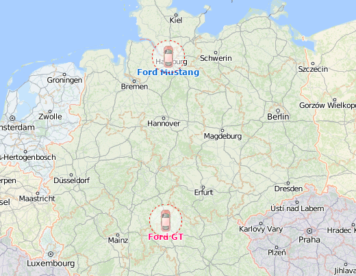
By default, a unit is indicated on the map by an icon and a caption with its name. You can select the icon from the icon library in the unit properties (for example, ), or upload your own image instead.
There are options which influence the way the icons are displayed. They are as follows:
| Option | Description |
|---|---|
Rotate icon | Enable this option on the Icon tab of the unit properties so that the icon rotates depending on the unit movement direction. |
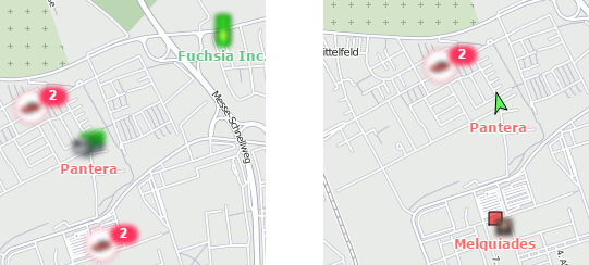
Display overlapping units in one icon | Enable this option in the user settings in order to replace overlapping unit icons with a common one which has a numeric indicator. You can select the common icon in the library after activating the option. For example, if six units are situated too close to each other, their icons can be replaced with this icon: The tooltip to the common icon shows the list of the grouped units. When you click on an icon, the map is scaled so that all the grouped units are within the field of view. The unit icons are not grouped on the two largest scales. |
Blur icons of inactive units | Enable this option in the user settings so that the icons of inactive units become blurred and their captions semi-transparent. Inactive units refer to those which haven't sent coordinates for more than 48 hours. Other units are considered active. If motion state signs are used instead of the icons, then when you enable this option, they become semi-transparent as well as the unit captions. If the Display overlapping units in one icon option is enabled and all the grouped units are inactive, their common icon becomes blurred. Also, the icons of the drivers and trailers assigned to inactive units are also blurred until they are separated from these units. |
Show unit icons at map borders | Enable this option in the user settings to display unit icons at the map borders if the units are outside the visible area. Click on the icon to go to the unit. |
Allow positioning by cellular base stations | When this option is enabled on the Advanced tab of the unit properties, its location is determined using LBS data if GPS data is invalid. In this case, the unit icons are shown as follows: |
Motion state signs
You can replace the unit icons by motion state signs which show whether the units are moving or not. To do this, enable the Replace unit icons with motion state signs option in the user settings. The following signs are used:
Sign | Description |
The unit is moving. The direction of the arrow indicates the movement direction. | |
The unit is standing. If an ignition sensor is configured in the unit properties, it means that the engine is stopped. | |
The unit is standing with the engine on (only for units with ignition sensors). |
Additional elements
Additional elements can be used to display units on the map. You can enable them in the menu of visible layers on the map.
The following elements are available:
| Element | Description |
|---|---|
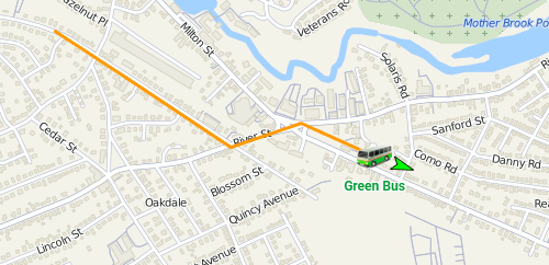
Unit trace | The line corresponding to the latest movement of the unit. It is shown behind the unit icon or motion state sign. To see the unit trace, you should enable it in the user settings as well as in the menu of visible layers. In the user settings, you can also specify the trace parameters, such as the line colour, width, and the number of the recent messages on the basis of which the trace is generated. |
Unit name | The caption with the unit name. The caption colour is red by default, but you can change it on the Advanced tab of the unit properties. The icon to the left of the caption means that the Do not show unit location option is activated for the unit and the private trip mode has been detected. |
Driver's name | The caption with the driver's name, if the driver is assigned to the unit. The same colour is used for this caption as for the unit name. |
Unit movement direction | The green arrow which shows the movement direction of the unit. |


