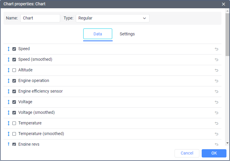
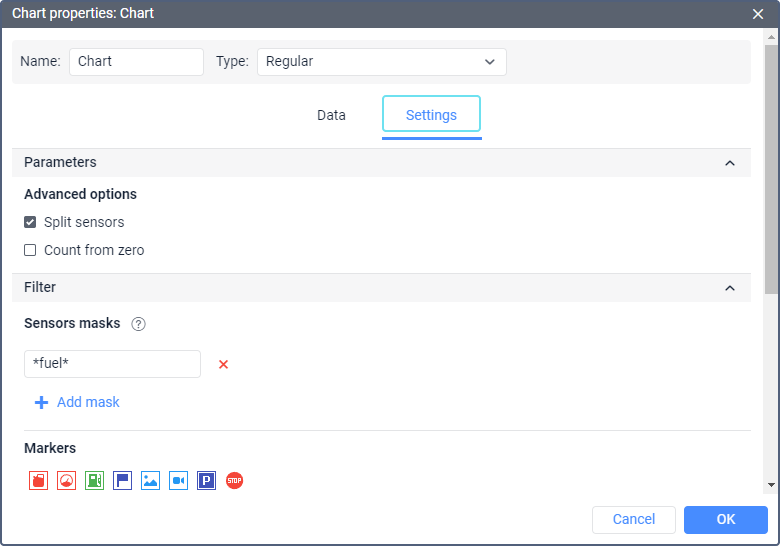
There are two tabs in the chart properties: Data and Settings.
Data selection
On the Data tab, you can select the lines that should be displayed in the chart. The selection is only available for charts of the Regular type.
Select the lines you want to see in the report. You can select no more than 6 variables. However, several lines can correspond to one variable, for example, Speed and Speed (smoothed). Therefore, the resulting number of the selected lines may be more than 6.
To change the line name, click on it with the left mouse button and edit the text. To reset the original name, click on the Default icon (). The icon is inactive if the name has not been changed.
In addition, it is possible to change the order of the items. To do this, drag the icon located to the left of the required line up or down.
Chart settings
In addition to selecting columns, the settings are available on the same-name tab.
The tab is divided into two sections:
Parameters
In the Parameters section, it is possible to activate the Split sensors and Count from zero.
Split sensors
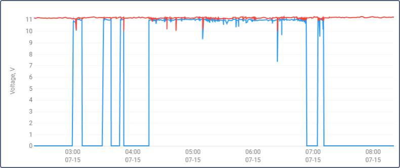
If a unit has several sensors of the same type and you need to create a chart for this type, then by default the lines of such sensors are displayed in the same chart. Check the Split sensors option to create an individual chart for each sensor. For example, for a unit with two voltage sensors, external and internal, a chart with two lines (the option is not checked) can be built, as well as two charts with one line (if the option is checked).
If for the data points selected for a chart there are several sensors, the upper one is split. Let us assume that a unit has two voltage sensors and two temperature sensors, and you are building a voltage/temperature chart for it. If the Split sensors option is off, you will get one chart with four lines in it. If the Split sensors option is on, you will get two charts with three lines on each: one chart will contain the first voltage sensor and both temperature sensors, and another one will contain the second voltage sensor and both temperature sensors.
Count from zero
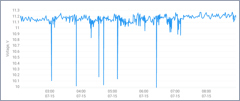
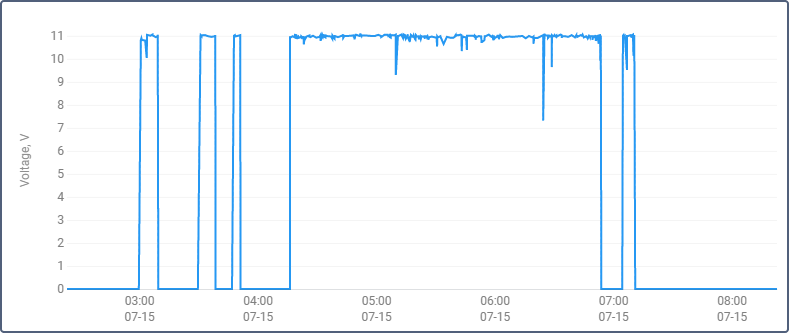
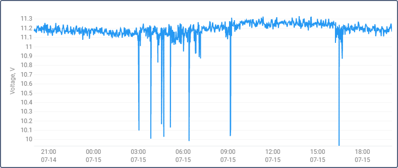
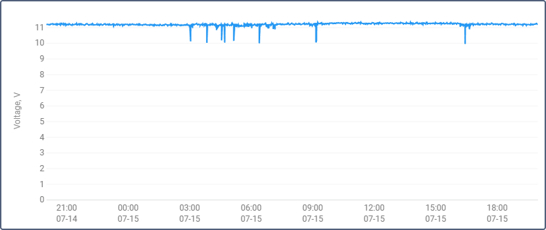
The Count from zero option is responsible for scaling the chart. By default, the range of the Y scale depends on the range of values falling within the specified interval. That is, if, for example, the temperature fluctuates from 3 to 5 degrees, then the reading on the Y scale starts at 3, and the line, in this case, occupies the maximum space on the chart. If the Count from zero option is activated, the Y-axis on the graph is always built from zero to the largest value (if the values are negative, then from the lowest value to zero).
The image below shows an example of two voltage charts for the same unit within the same time interval. The first chart is regular, the second — with the Count from zero option turned on.
Filter
The following settings are available in the Filter section:
- Sensor masks;
- Markers;
- Background;
- Line color.
Sensor masks
This option allows you to specify the sensors on the basis of which the chart should be built. The option does not influence the Speed, Altitude, Fuel consumption by math charts, as they can be built regardless of whether a unit has sensors or not.
Specify the mask of the required sensor. To do it, enter its full name or part of the name. You can use special characters: * (replaces any number of characters) or ? (replaces one character). The name of the sensor cannot contain commas.
If the masks are not specified, the sensors of the required for building the chart type are determined automatically.
Markers
This setting allows you to select the markers that should be displayed in the chart. The same markers as on the map can be displayed here, except for the markers of initial and final positions and the markers of violations.
The setting of graphical element filtering influences the display of markers and backgrounds.
Background
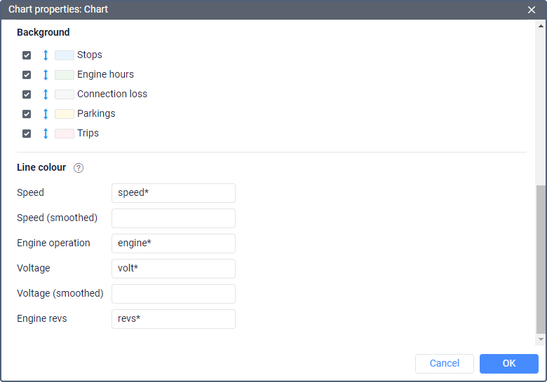
The intervals of such events as stops, parkings, trips, connection losses, and work of engine hours can be used as a chart background. Using these backgrounds you can correlate a chart value and an interval to which it corresponds. Different colors can be assigned for the event intervals. To select a color, click on the color box, choose the color from the palette and click OK.
The background of the event intervals is opaque and has a display priority, that is, the interval above is overlapped by the lower ones. To change the priority, drag the desired interval of events up or down using the double arrow icon to the left of the name of the desired interval.
Line color
For each line selected on the Data tab, you can specify a sensor, the readings of which should affect the line color in the chart. To do this, type the sensor name or its mask in the field next to the name of the line. Colors and the value ranges corresponding to them are configured in the sensor properties.
The shape and color of the line can depend on the same sensor or two different ones.
Example 1. A sensor of the Fuel level sensor type is specified for the Fuel level line. In this case, the shape and color of the line are based on the same sensor.
Example 2. A sensor of another type, e.g. Voltage sensor, is specified for the Fuel level line. In this case, the shape of the line corresponds to the fuel level, while its color represents voltage values.
If no sensor is specified for a line, or intervals and colors are not configured in the properties of the specified sensor, a default color will be used to display such a line.


