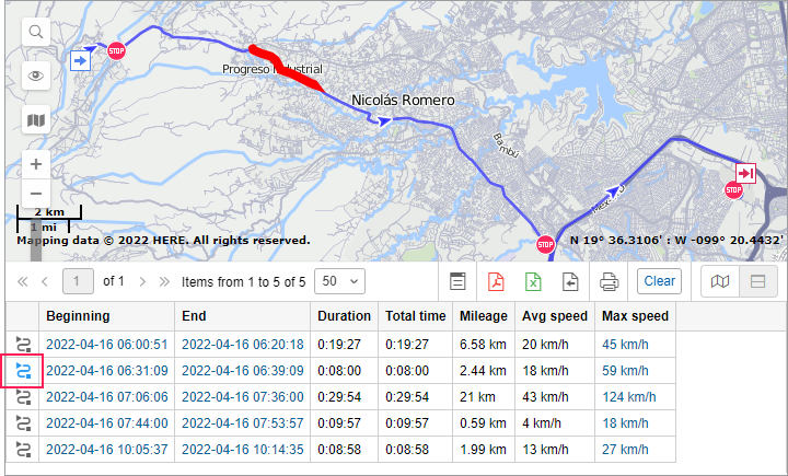
Map Output
The lines of the online report, which contain information about the location of the unit at the time of an event, are highlighted in blue. If you click on the line with the left mouse button, the message is marked on the map with a special marker, and the map, in turn, is centered on its location. A similar option works for some Regular charts (where the X scale represents time): when using the trace tool, you move to the message on the map.
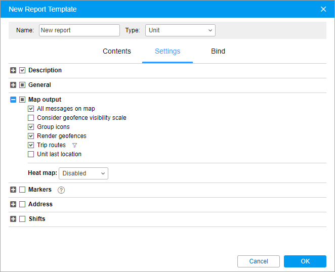
Unit tracks and geofences can be drawn on the map as a part of the report. They can be selected in the Map output section on the Settings tab of the report template dialog.
For some types of reports, you can select special markers in the form of small icons which can be put in the places of events, fillings, thefts, speedings, etc.
Some data can also be displayed in the form of a heat map. Its color varies from blue (minimum) to red (maximum) depending on the amount of data. In the drop-down list of the Heat map field, select one of the options:
- all messages;
- stops;
- trips;
- speedings;
- parkings.
All graphical elements are shown for the current report. If generating a new report, all tracks and markers from the previous report are erased and replaced by new. When switching to other panels, all graphical elements from the current online report, as well as a map position and zoom remain on the map. To remove them, return to the Reports panel and click on the Clear button. Alternatively, the graphics of any panel can be hidden or displayed again. To do this, select the corresponding options in the horizontal menu. More information about using map with different panels can be found here.
Graphical elements filtration
Interval filtration is supported for some graphical elements (e.g. trip routes, markers of speedings, events, fillings, thefts, parkings, and stops) adjusted upon working with a report template. To set interval filtration means to indicate parameters considered for displaying graphical elements on the map. The values of filtration parameters are indicated for each element individually. A set of available filtration parameters for such an element corresponds to a set used for the interval filtration in a similar-type table.
To open the filtration parameters dialog, it is necessary to click on the corresponding icon ( ) to the right of a graphical element.
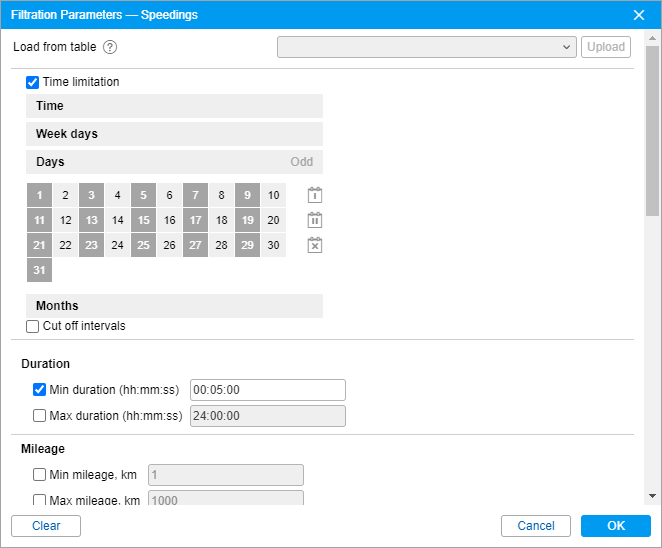
If interval filtration has been already set for a table of the corresponding type, and such a filtration needs to be set for displaying graphical elements on the map as well, you can facilitate a process of indicating the filtration parameters by uploading those applied to the table. To do so, select a corresponding table in the drop-down list (the first line of the dialog) and click Upload.
To reset the indicated filtration parameters, click Clear. To leave the dialog without applying changes, press Cancel. To apply selected settings, click OK.
The filtration set for displaying graphical elements on the map also affects the corresponding markers and backgrounds chosen for charts.
Tracks in reports
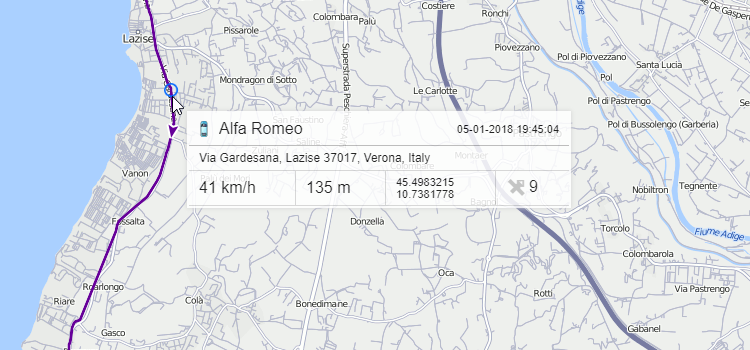
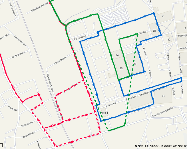
The routes traveled by a unit in a selected period of time can be shown on the map. To do this, select one of the options: Trip routes or All messages on map in the report template dialog. In accordance with the first option, only the intervals considered as trips (according to the trip detector) are displayed as tracks with different colors. In the case of the All messages on map option, all the messages with valid coordinates are converted into a track regardless of trips, parkings, stops, etc. If in the unit history there are intervals where the connection was lost (there were no messages for a long time) or coordinates were not determined in messages, such intervals are displayed with a dashed line.
You can configure the track color (by trips, single, by speed or by sensor) in the Track colors section on the Advanced tab of the unit properties. When the All messages on map option in the report template is enabled, the color setting by trips does not work.
Besides, to get the information about track points, hover the mouse cursor over and see the information in a tooltip (time, speed, coordinates, altitude, sensor values). Note that messages are searched in the radius of 50 pixels to the cursor.
If you enable the Trip routes or All messages on map option in a report on units or unit groups, then such tables as Engine hours, Trips between geofences, Speedings, Trips have an additional first column with the icons  . After clicking on the icon, the map is centered on the corresponding segment of the track which is highlighted with a red line. This function is also available for the Trips table in reports on drivers.
Tracks can be rendered for units groups, too (see the Advanced reports section). It is reasonable to assign different colors for units in a group to differentiate them on the map.
The number of simultaneously drawn messages can be limited by your service provider.
Geofences in reports
Created geofences can be a part of a report. They are displayed on the map if you enable the Render geofences option in the Map section of the report template.
Geofences are taken only from the same account as the report template itself.
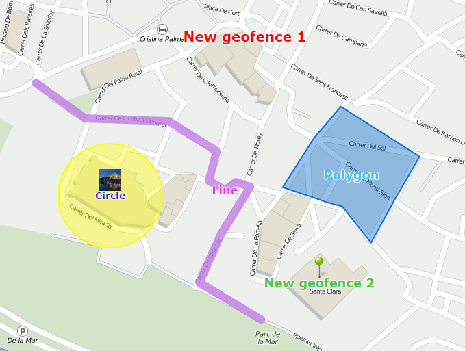
Geofences are displayed with their captions and images or icons (if you have selected any). The color and the font size of the caption is taken from their properties. Apart from that, additional options can be applied to geofences.
Group icons
The geofences that overlap each other can be replaced by one conditional item, and its tooltip contains detailed information. The same can be applied to markers.
Consider geofence visibility scale
By default, all the geofences are rendered on the map. However, they can be seen or hidden according to their visibility parameter set in the properties.
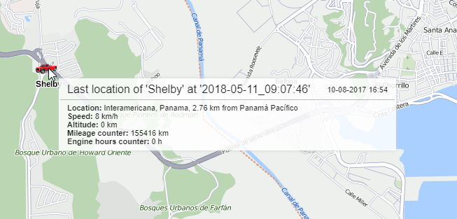
Unit last location
The last location of the unit can be displayed on the map. To enable this feature, select the Unit last location checkbox in the map output settings of the report template. The last location does not depend on the reported interval, it is taken from the latest message received from the unit. Units are displayed on the map by their icons or by motion state signs (depending on the user settings) as well as by their names considering the Unit label color option. In the pop-up tooltip you can find the time when the message was received, the speed at that point, altitude, and the values of mileage and engine hours counters.