Data Messages
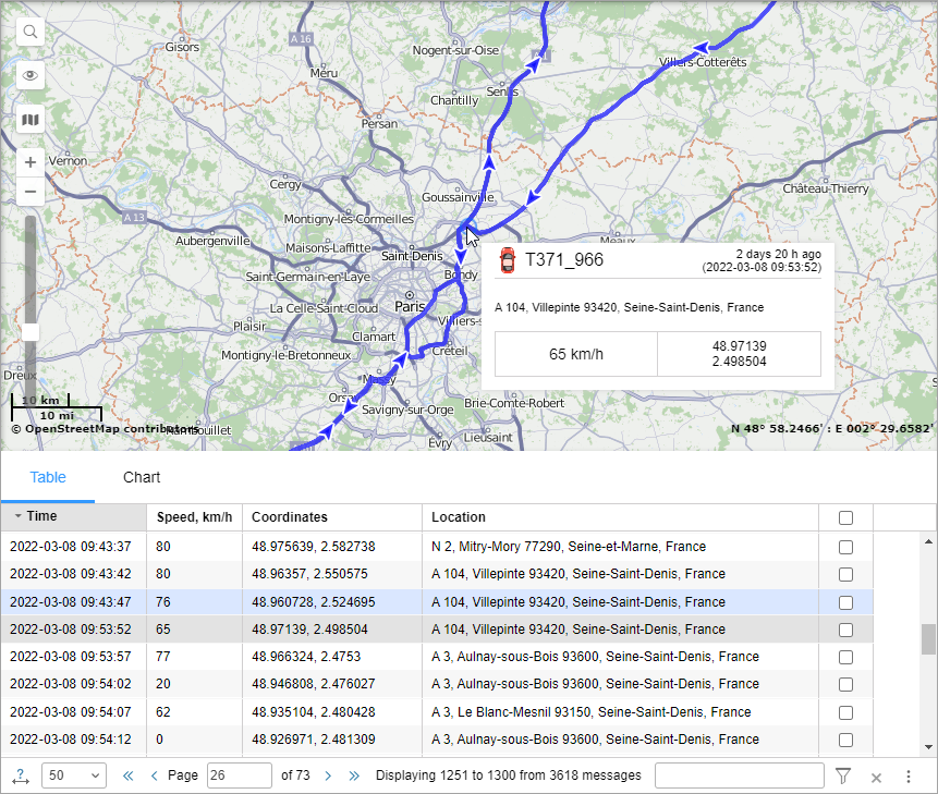
In the table with data messages, you can see the time of the message, the speed and location of the unit at the time of sending it, and other available parameters. In addition, you can find summary information on the results of the query in the Statistics section.
Two options of displaying parameters are available.
| Option | Result |
|---|---|
| Raw data | All the parameters are displayed in one line in each table column. |
| Sensor values | The value of each sensor is displayed in a separate column according to the calculation table. By default, only the values of visible sensors are displayed. You can manually add columns with the values of other sensors. |
The table has the following columns.
| Column | Description |
|---|---|
| Time | The date and time of the message. |
| Registration time | The date and time when the message was received on the server (disabled by default). |
| Speed | The speed of movement of the unit according to the message. |
| Coordinates | The latitude and longitude of the position of the unit. The number of locked satellites is indicated in parentheses. |
| Altitude | The height above the sea level. If the device cannot transmit height data, a dash is displayed in the column. |
| Location | The address of the unit when sending the message. |
| Parameters (if available) | The values of the parameters of all available sensors. The messages can be filtered by parameters. Sensor parameters can be displayed in separate columns of the table. To do this, you should select the Sensor values option of displaying parameters. |
| Media | In this column, you can open images or videos sent by the unit. To do this, click on the icon . To save an image, open it and click Save as in the lower-left corner of the window. |
| Delete | The selection of messages you want to delete. |
The following messages are highlighted in the table:
 : alarm messages (SOS messages from the device or messages with non-zero values of the Alarm trigger sensor);
 : black box messages (messages which were sent to the server not in real time but with a delay of a few minutes or days);
 : messages with the location determined by Wi-Fi;
 : messages with the location determined by LBS;
 : imported messages.

Statistics
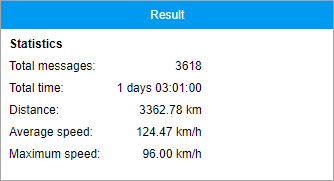
This section provides general information about messages for the selected interval.
The units of measurement (metric or American) for values in statistics depend on the settings specified in the unit properties.

| Row | Description |
|---|---|
| Total messages | The total number of messages from the unit. |
| Total time | The interval between the first and the last message from the unit. |
| Distance | The mileage travelled by the unit. If there is invalid data in the indicated interval, the mileage in messages may differ from the mileage in reports. In such cases, the mileage in the reports is considered more accurate. |
| Average speed | The average speed value of the unit. |
| Maximum speed | The maximum speed value of the unit. |
Using the map
After querying messages, the track of the unit is displayed on the map.
Select any message in the list by left-clicking on it. The message is highlighted in grey in the table and identified by the marker  on the map.
The track colour is blue by default. You can configure the track colour by speed or sensor value on the Advanced tab in the unit properties.
When you point to the track, the nearest message is searched. If such a message is found within a radius of 50 pixels, the point of receiving the message is highlighted by a pulsating circle, and detailed information is displayed in the pop-up window: the time when the message was received, address, the speed of the unit at that point, altitude, coordinates, number of satellites, sensor values.
When you open other tabs, the map layout and the track lines are saved. To clear the map, you can disable the Messages layer or go back to the same-name tab and press Clear.
Charts
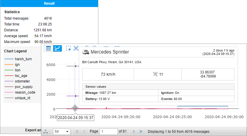
In addition to the table, the results of the message query can also be shown as a chart. To switch between the modes, use the following buttons:
 : show a table with parameters;
 : show a chart with parameters.
When using the chart mode, the Chart legend section is displayed in the work area on the left. In the section, you can select the parameters you want to show on the chart. The number of curves on the chart corresponds to the number of the selected parameters. For convenience, the chart curves are highlighted in different colours.
You can change the scale of the chart using the icons  /
/ in the top bar or using the scroll wheel of the mouse. To zoom an area of the chart, click on the icon
  and select the required area with the left mouse button. Click on the icon
  to scale the chart automatically.
When you point to the key points of the chart, a tooltip with additional information is displayed. To move between pages, use the arrows  /
/ and
and  /
/ in the navigation bar below the chart.
