Dashboard
Dashboard is a tool that displays statistics in the form of graphs or tables. To open Dashboard, click on the same name button, located in the top panel of the management system.

Dashboard structure
Information on the page is presented in the form of information blocks (graphs) with statistical data for the specified period. In the top panel of the Dashboard, you can select the time interval (on the left), as well as the account (on the right) for which the statistics are required.
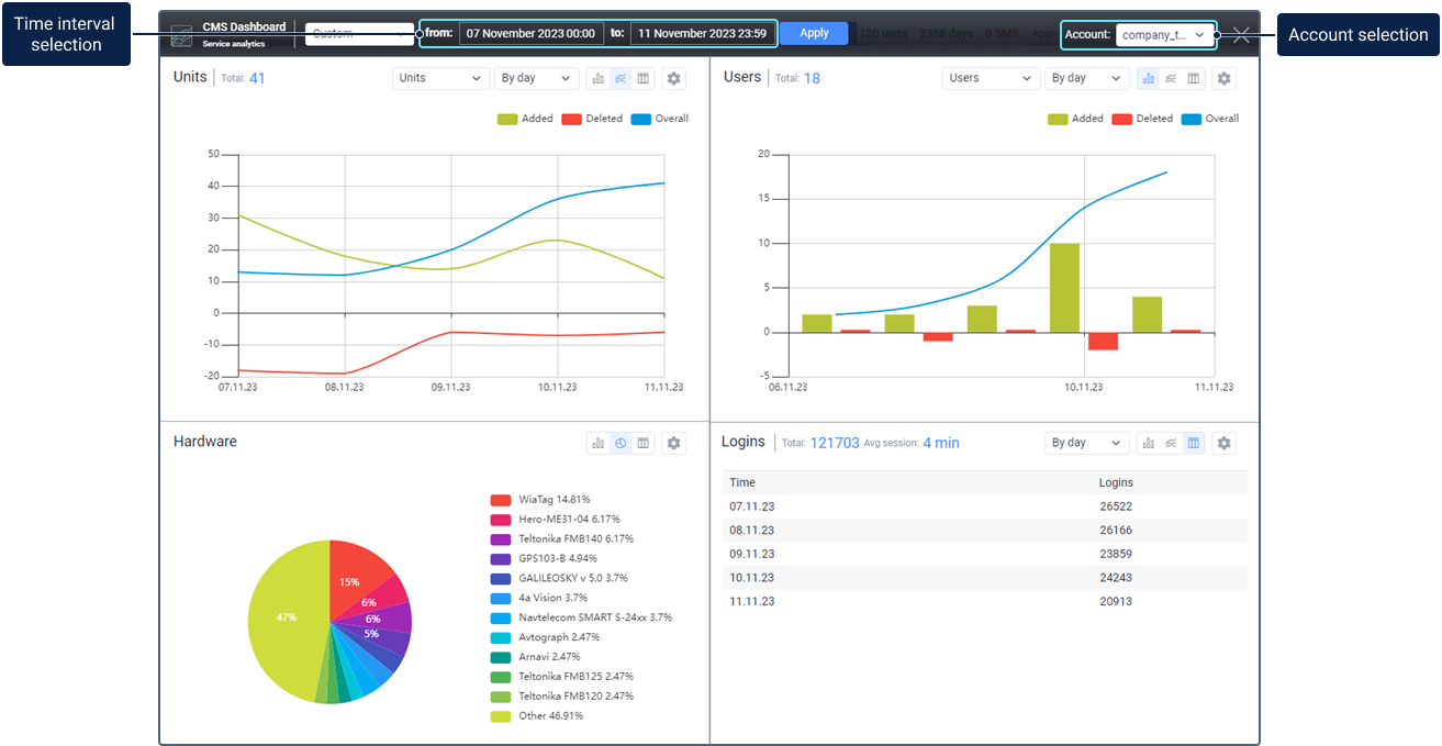
The number of blocks can vary from 1 to 8.
Information blocks can be added, deleted, moved, and resized.
Click on an empty cell to add a new graph.
To move the information block with a graph, move the mouse cursor over its header (the arrow of the cursor changes to the hand pointer) and, while holding the left mouse button, drag the graph to the required position).
Click on the basket icon in the settings of the graph to remove it.
To change the ratio between the blocks, drag the horizontal or vertical separator up/down or left/right, accordingly.
Information block
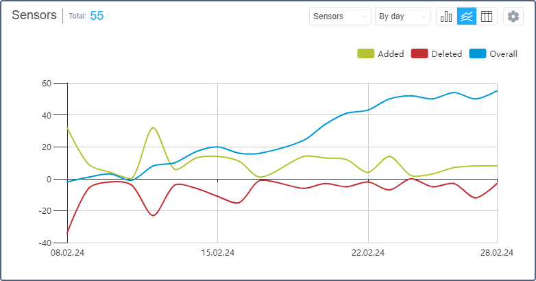
The name of the graph is indicated in its header on the left together with the Total indicator. On the right, there are drop-down lists and switches, which, depending on the graph type, allow you to change its form, the type of the object, or grouping. Here is also the button to open the settings window.
When you move the cursor over the elements of a bar, line, or pie chart, tooltips appear with the information on the selected element.
Such graphs as a bar and line chart are scaled with the mouse scroll wheel.
Visualization of some elements of the graphs in the information blocks can be switched off. To do it, click on the button of the required element located above (for the bar or line chart) or on the right (for the pie chart) from the graph.
If you need to edit the graph, click on the button in the form of a gear located in the upper right corner of the header. Make the necessary adjustments in accordance with the data type and press Save.
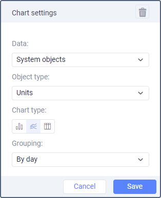
Graphs for 4 types of data are available on the Dashboard page: system objects, hardware, SMS use, and logins.
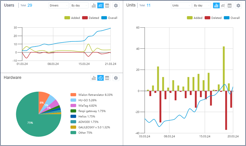
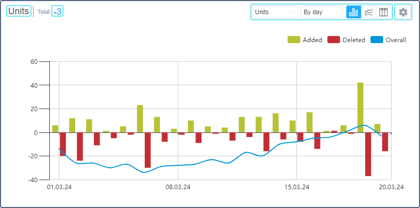
System objects
This block contains information on the increase or decrease in the number of system objects in use (units, users, resources, routes, notifications, jobs, sensors, drivers, trailers, geofences, passengers). The Total indicator shows the total increase or decrease in the reporting period.
The data of the System objects graph can be presented in the form of a bar or a line chart, or a table and grouped by days/weeks/months/quarters.
Each graph contains information about added and deleted objects. If the object Units is selected, the number of activated and deactivated units is also shown. In addition, the bar and line charts show the difference between the number of added and deleted objects from the beginning of the period to the selected point on the graph (Overall).
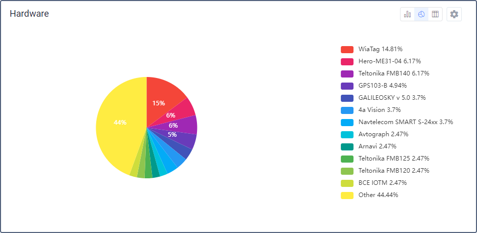
Hardware
This block contains the information about the added or deleted units with a certain type of hardware. The Hardware graph data can be presented in the form of a bar or a pie chart, or a table.
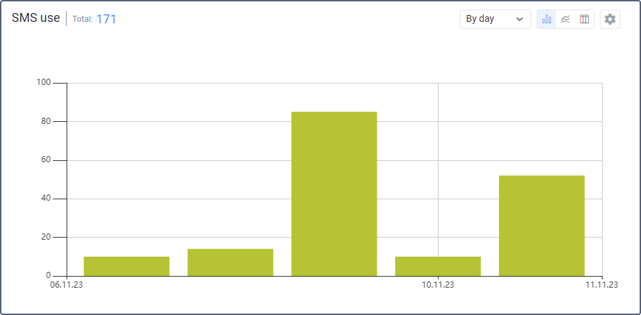
SMS use
This block contains the information about SMS consumption. The Total indicator displays the total number of SMS messages sent during the reporting period.
In the settings of this chart, in the Display data for drop-down menu, you can select the type of data that will be displayed in the chart. Available options are described below.
Consumption
The data on the total SMS consumption can be presented in the form of a bar or a line chart, or a table and grouped by day/week/month/quarter.
Dispatch method
The data on the method of sending SMS messages can be presented in the form of a pie, a bar or a line chart, or a table.
Users
The data about users can be presented in the form of a pie chart or a table.
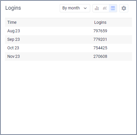
Logins
This block contains the information about the entries in the system. The Total indicator displays the total number of entries to the system and the average time of the session.
These graphs can be presented in the form of a bar, a line chart, or a table and grouped by day/week/month/quarter.