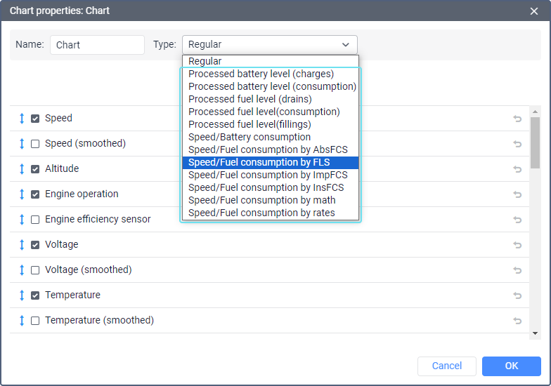
Chart Types
The charts available in reports can be divided into regular and special ones.
Regular charts
The charts of this type differ in that the X-axis always lays time, and the data for the Y-axis is selected from the list on the Data tab:
- Speed (km/h or mph);
- Altitude (meters or feet);
- Engine operation (on/off);
- Engine efficiency sensor;
- Voltage (volts);
- Temperature (degrees Celsius);
- Engine revs (rpm);
- Cargo weight;
- Counter sensor;
- Custom sensors;
- Custom digital sensors (on/off);
- Absolute mileage;
- Mileage in trips;
- Instant mileage;
- Fuel level (liters or gallons);
- Processed fuel level (liters or gallons);
- Fuel consumption by ImpFCS;
- Fuel consumption by AbsFCS;
- Fuel consumption by InsFCS;
- Fuel consumption by FLS;
- Fuel consumption by math;
- Fuel consumption by rates;
- Battery level;
- Processed battery level:
- Battery consumption.

You can select no more than 6 variables for a chart. However, several lines can correspond to one variable, for example, Speed and Speed (smoothed). Therefore, the resulting number of the selected lines may be more than 6.
The picture below shows the speed chart combined with the fuel level chart. To receive such a chart, it is required to set the chart type as Regular and select the Speed, Speed (smoothed) and Fuel level data.
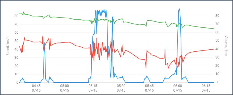
Each curve on a chart is assigned its own color. On the left, in the Report result block, you can specify which color corresponds to which curve. Their names are taken from the report template. In addition to the name for the curves, the units of measurement are also indicated.
The names of the lines of the chart can be changed in its properties in the report template. However, if the line is displayed on the basis of sensor readings, then it is given the name of the sensor. The sensors the readings of which should be displayed in the chart are selected in its settings.
Click on the curve name in the Report result section to enable/disable its display on the chart.
Smoothing
Most line charts of the Regular type have two versions: without smoothing and with smoothing. Smoothed versions are indicated in parentheses after the chart line name, for example, Speed (smoothed).
Smoothing affects the appearance of chart lines. Charts without smoothing are built strictly from message to message, resulting in angular outlines. Smoothed charts use a predefined smoothing algorithm to create smoother curves. This algorithm is the same for all charts and can’t be customized.
The smoothing algorithm applies a median filter with a window size calculated as the total number of points divided by 100.
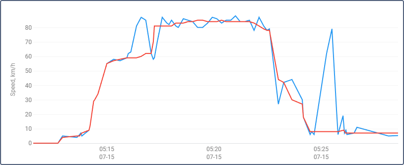
Below is an example of a chart in which a blue line shows a speed chart without smoothing, and a red one shows a smoothed speed chart.
The following charts are smoothed:
- Custom digital sensors (smoothed)
- Custom sensors (smoothed)
- Engine revs (smoothed)
- Fuel consumption by AbsFCS (smoothed)
- Fuel consumption by FLS (smoothed)
- Fuel consumption by ImpFCS (smoothed)
- Fuel consumption by InsFCS (smoothed)
- Fuel consumption by math (smoothed)
- Fuel consumption by rates (smoothed)
- Instant mileage (smoothed)
- Speed (smoothed)
- Temperature (smoothed)
- Voltage (smoothed)
Smoothing of the filtered sensor values
Smoothing is independent of the filtering level indicated in the sensor properties. Filtered sensor data are shown in smoothed charts and charts without smoothing.
If the filtering level is set in the sensor properties and you generate a smoothed chart, the sensor data is filtered and then smoothed, that is, processed twice.
Example. The filtering level of the temperature sensor is set. The Regular chart with the lines Temperature and Temperature (smoothed) is generated. The Temperature line is built based on the filtered values. The Temperature (smoothed) line uses the filtered sensor data that is further processed by the smoothing algorithm.
Regular fuel level charts
Two fuel level charts are available among the charts of the Regular type.
| Chart | Description |
|---|---|
Fuel level | Shows data taking the temperature coefficient into account without applying smoothing. |
Processed fuel level | If filtering is configured in the properties of the selected sensor, smoothed data is shown. The smoothing depends on the filtering settings. The temperature coefficient is also taken into account in this chart. |
Unlike special fuel level charts, the regular charts show data only in the litre-to-time ratio. However, you can select other data, such as voltage, so that it is displayed on the chart with the fuel level.
Regular battery level and consumption charts
The charts of the Regular type, which display battery level and consumption, show the change in this data in relation to time. You can overlay other graphics on them.
| Chart | Description |
|---|---|
Battery level | Shows the readings of the battery level sensor without smoothing. |
Processed battery level | If filtering is configured in the properties of a battery level sensor, smoothed data is shown. The degree of smoothing depends on the filtering settings. |
| Battery consumption | Shows the amount of energy consumed per unit of time (kWh/hour). |
Unlike special battery level charts, the regular charts show data only in the kWh-to-time ratio. However, you can select other data, such as voltage, so that it is displayed on the chart with the battery level.
Regular mileage charts
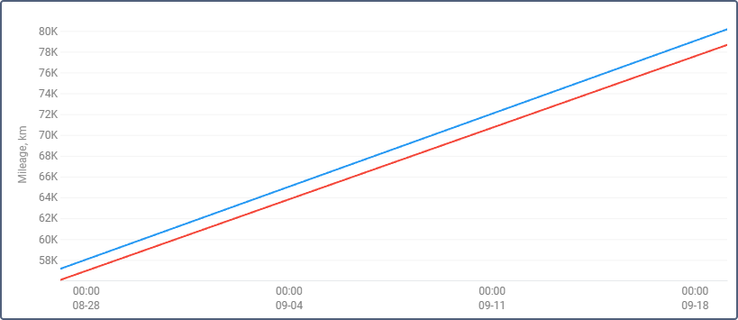
Four kinds of mileage charts can be created: absolute mileage, mileage in trips, instant mileage, and instant mileage smoothed. The first two show how mileage changed (increased) over time. Absolute mileage chart is built on the basis of all messages, which means that any inaccuracy and outlying data affect the resulting chart. Mileage in trips chart displays the data taking trip detector settings into account. Below you see the chart with curves for absolute mileage (blue) and mileage in trips (red).
The Instant mileage chart represents the data in the mileage from the previous message to the current one form, that is the difference in the distance between two adjacent messages. This kind of chart can be useful to detect excessive mileage during connection loss, or to detect made-up additions to the mileage in cases where it is determined by special sensors (see the settings of the mileage counter in the unit properties). Instant mileage can be smoothed.
Special charts
Along with the regular charts, the following special charts are available:
- Processed battery level (charges);
- Processed battery level (consumption);
- Processed fuel level (consumption);
- Processed fuel level (fillings);
- Processed fuel level (drains);
- Speed/Battery consumption;
- Speed/Fuel consumption by AbsFCS;
- Speed/Fuel consumption by FLS;
- Speed/Fuel consumption by ImpFCS;
- Speed/Fuel consumption by InsFCS;
- Speed/Fuel consumption by math;
- Speed/Fuel consumption by rates.
Settings for these charts are fixed and cannot be changed. Editing is available only for the name of the chart. Also, it is possible to select the required sensors (indicate the mask of the sensor).
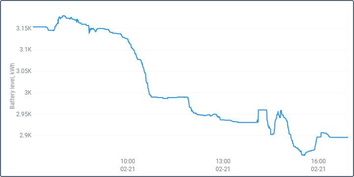
Processed battery level
The Processed battery level special chart shows the data on battery level that is taken into account when detecting charges and determining the battery level in report tables.
The chart shows the dependence of the battery level on time (kWh/time). The chart is processed taking into account the filtering type selected in the sensor settings.
Below is the Processed battery level (consumption) chart. Before generating it, adaptive median filtering was set for the battery level sensor.
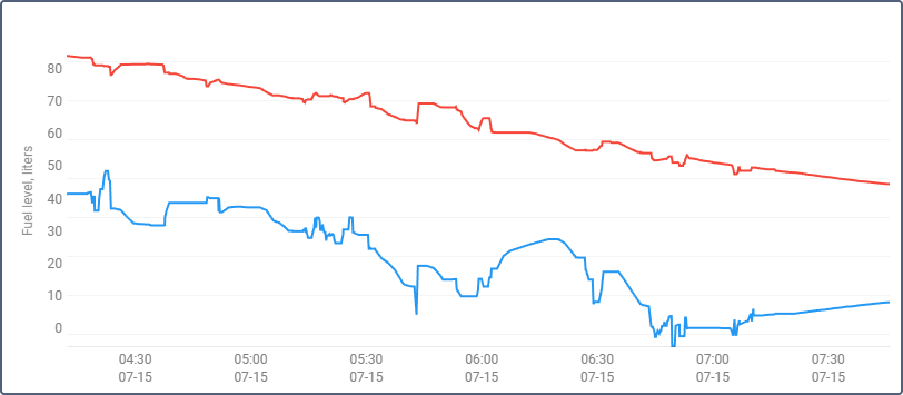
Processed fuel level
The special Processed fuel level chart shows the values which are used while calculating fuel level, fillings and drains in tables.
The chart shows the dependence of fuel level on mileage (litres/mileage). It can also show the dependence of the fuel level on time (litres/time) if the Calculate fuel consumption by time option is turned on in the sensor settings. In both cases, the chart is processed taking into account the filtering that is also set in the sensor settings.
The special Processed fuel level chart should be distinguished from two similar regular charts.
Below is the special Processed fuel level (consumption) chart. The Calculate fuel consumption by time option is enabled, median filtering is configured, the filtering level is 3.
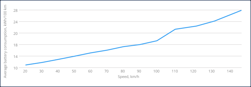
Speed/Battery consumption
The chart shows the dependence of battery consumption on speed. The chart data is taken from the readings of the battery level sensor.
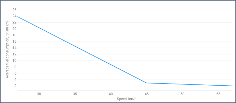
Speed/Fuel consumption chart
This chart shows the dependence of average fuel consumption on speed. The data for it is taken from fuel consumption sensors of different types (such as impulse, absolute, instant) or fuel level sensor, or predefined consumption by math or rates. The calculation methods must be specified in the properties of the required sensors.