Working with charts
Working with a chart consists in
- interacting with its legend;
- viewing information about points and going to messages;
- using the tools.
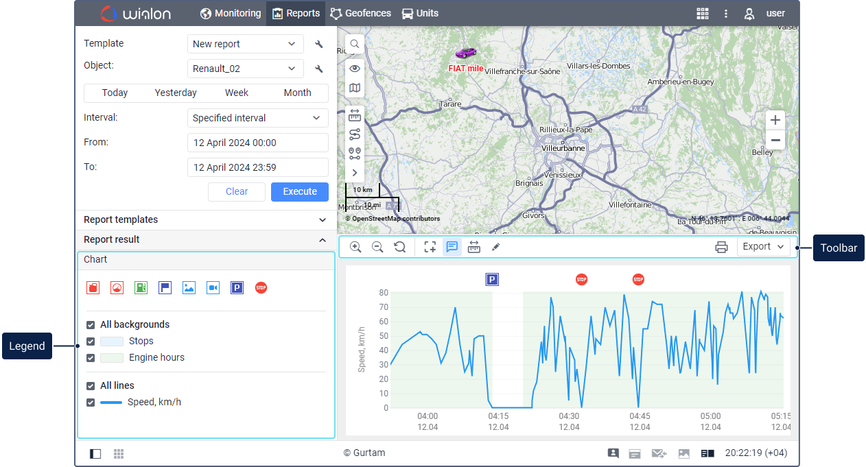
Chart legend
The chart legend is displayed in the work area. Depending on the chart settings, the legend may contain three sections: markers, backgrounds, lines.
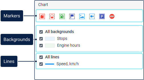
Markers
This section displays the markers selected in the chart settings. The tooltip of each marker shows the type of events it denotes. If several fuel level sensors are configured for a unit, the fuel filling and drain markers corresponding to each of them have a numeric indicator.
Click on a marker in the legend to hide or show it in the chart. The tooltips of the markers in the chart show information about the marked events.
The chart markers are displayed according to the settings of filtering graphical elements.
Backgrounds
This section contains the backgrounds selected in the chart settings. All the selected backgrounds are displayed on the chart by default. To remove a background from the chart, disable it in the legend. For disabling or enabling all the backgrounds, use the All backgrounds checkbox. To see only one background and remove the others, point to it in the legend and click Only this.
The chart backgrounds are displayed according to the settings of filtering graphical elements.
Lines
This section contains the lines of the data selected in the chart properties. If no sensors are specified in the chart settings in order to apply their color intervals to the lines, the line colors are selected randomly each time you run the report.
The lines of all the selected data are displayed in the chart by default. To remove a line from the chart, disable it in the legend. For disabling or enabling all the lines, use the All lines checkbox. To see only one line and remove the others, point to it in the legend and click Only this.
The lines of the chart can be dashed on the segments where the interval between messages is greater than the value specified in the Maximum interval between messages parameter.
Viewing point info and going to messages
When pointing to any place of the chart, you can see a tooltip with basic information about this point: the date, time, and the parameter values received at that moment (or the moment near to that). The tooltip shows the values of all the lines selected in the legend.
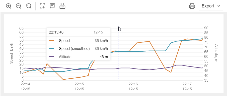
When you point to a certain line in the chart, the rest of the lines become lighter, and the name and value of this line is shown in bold in the tooltip.
When clicking on a point in the chart, you can see the icon  which allows you to go to the table with data messages. In this table, the message corresponding to the point is shown in a grey row. To hide the icon
  , click on it with the right mouse button or press Esc.
If the Messages: Access to the tab service is enabled for the account, then when you click on a point in the chart, the place corresponding to it is indicated with a marker on the map.
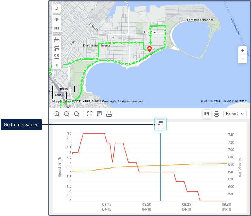
To analyze points in the chart, you can also use the Show detailed information about points tool.
Toolbar
The toolbar above the chart contains the following tools:
| Tool | Description |
|---|---|
 |
Zoom in. You can use the mouse scroll wheel instead of this tool. |
 |
Zoom out. You can use the mouse scroll wheel instead of this tool. |
 |
Show all the interval. This tool allows you to zoom the chart so that it displays all the selected lines. |
 |
Select and zoom in on a chart area. To use the tool, click on the icon and select the area you want to zoom in. To exit the selection mode, click on the icon again.This tool is unavailable when using the Compare data tool. |
 |
Show detailed information about points. Click on the icon to see tooltips with information from the unit messages when you point to the chart points. If a tooltip contains coordinates, when you click on them, it is possible to go to the map of a third-party source. See more.Sensor values in the tooltip are calculated on the basis of one message. If a sensor or its validator uses data from the previous message, the value of this sensor will be displayed incorrectly in the tooltip. This tool is unavailable when using the Compare data tool. |
 |
Compare data. To use the tool, click on the icon and then on the chart points the values of which you want to compare.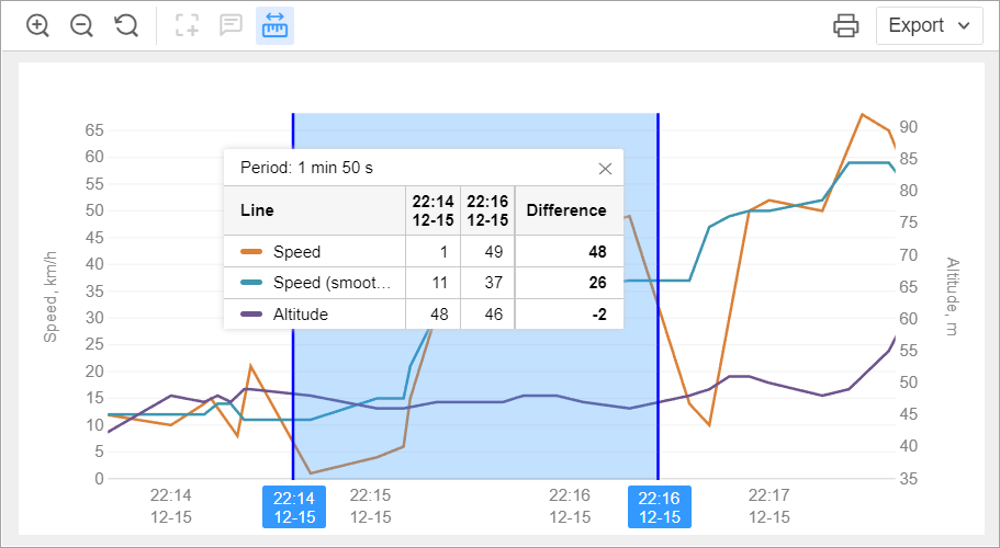 The interval between the selected points is highlighted in blue. The tooltip of the interval shows its duration and a table with the following columns:
To close the tooltip, click on the cross icon. You can change the selected interval by moving its boundaries. When using this tool, you can zoom in or out on the chart. To clear the selected interval, press Esc. To exit the data comparison mode, click on the tool icon. This tool is unavailable when zooming two charts simultaneously. |
 |
Zoom charts simultaneously. Available if two charts are open at the same time. This feature allows you to view basic information about points and use the first four tools (  , ,  , ,  , ,  ) on two charts simultaneously. When you perform any of these actions within one chart, it is also applied to the second. ) on two charts simultaneously. When you perform any of these actions within one chart, it is also applied to the second. |
 |
Mark events as false. Available only for Regular charts. The user must have the access right Create, edit and delete report templates to the resource where the report is stored. To see in the report the fillings and drains marked as false, the Show false events option must be enabled in the report settings. If the Render charts on server option is enabled in user settings, you cannot mark fillings and drains as false. To exclude false fillings and drains from the calculations, follow the steps below:
The next time the report is run, it will recalculate the number of fillings and drains, as well as the amount of fuel drained, filled and consumed. |
 |
Print the report. Read more about this feature here. |
 |
Export the report. To download the report, expand the drop-down list and select the required format. The following formats are available for quick export: XLSX (export of tables and statistics), PDF (export of all the content), PNG (export of charts).If you export the report to PDF, the chart is downloaded in its initial form, even if you have zoomed in or out on it. If you export it to PNG, the chart is downloaded in the same form as it is displayed on the screen. The drop-down list also contains the Export to file option (  ) which allows you to select a different format and/or configure additional settings. ) which allows you to select a different format and/or configure additional settings. |
 |
Close the chart. This icon is shown when you work with two charts, a chart and a table, or a chart and statistics at the same time. |