Configuring emissions Dashboard widgets
Who can do it: Service provider
Where: Wialon Platform FleetSpace
Wialon Platform FleetSpace provides Dashboard widgets for visualizing fleet CO2 equivalent (CO2e) emissions data. These widgets help customers track emissions trends, compare data across fuel types and vehicle types, and understand the sources of emissions calculations.
To add emissions widgets to the Dashboard:
- Log in as a customer to Wialon Platform FleetSpace.
- Navigate to the Dashboard page.
- Enable the editor mode.
- Click the Add widget button.
- In the Add to dashboard panel, locate Emissions. You can also use the search to find the widget by name.
- Click the icon
 next to the desired widget name.
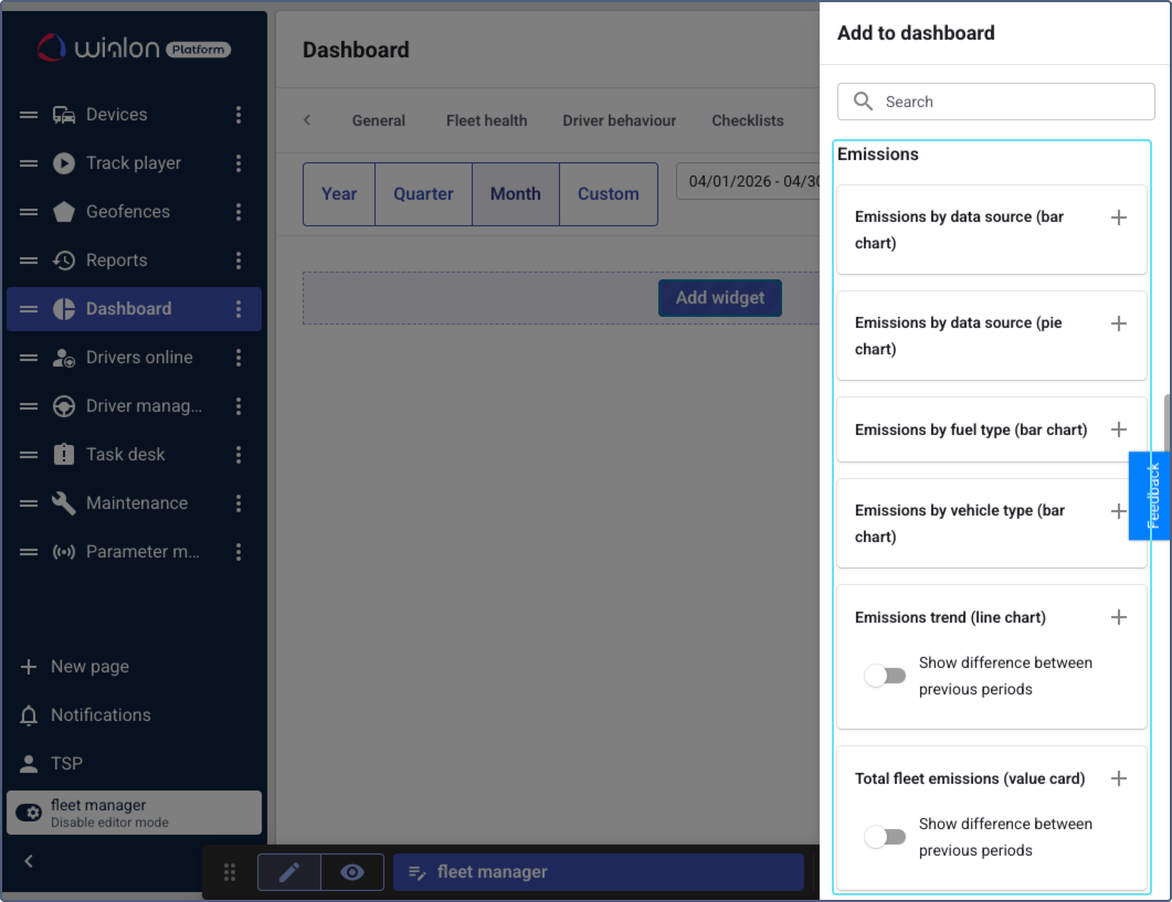
The following emissions widgets are available:
-
Emissions by data source (bar chart): Shows how total emissions are distributed by data source over time. It lets users compare emissions calculated from fuel volume data and emissions estimated from mileage or engine hours within the same reporting period. This helps assess the accuracy of emissions reporting and identify vehicles that could benefit from adding a fuel volume sensor for more precise calculations.
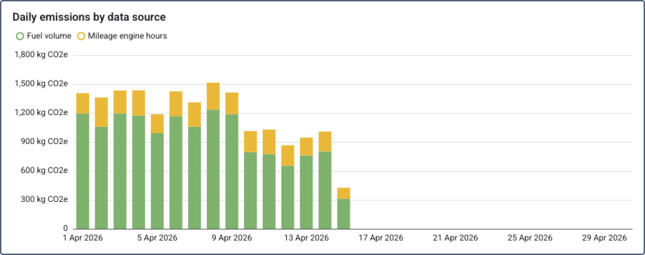
Click a chart segment to view the list of devices for the selected data source and date, including device name, data source, and total emissions. You can also go to the Scope 1 emissions report from the details.
-
Emissions by data source (pie chart): Shows the total emissions split by data source as a pie chart. It helps to assess what share of emissions comes from actual fuel measurements compared to mileage-based estimates. The total CO2e value is displayed in the center and automatically uses the most appropriate unit: kg CO2e for smaller totals and t CO2e for larger totals.
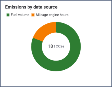
Click a chart segment to view the list of devices for the selected data source, including device name, data source, and total emissions. You can also go to the Scope 1 emissions report from the details.
-
Emissions by fuel type (bar chart): Shows the distribution of calculated CO2e emissions across fuel types (for example, diesel, petrol, electric) for the selected time period. This helps identify which fuel types contribute the most to fleet emissions and evaluate the impact of transitioning to lower-emission energy sources.
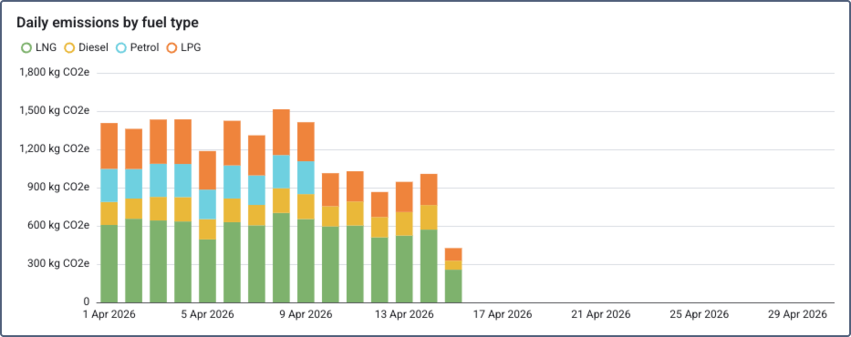
Click a chart segment to view the list of devices for the selected fuel type and date, including device name, fuel type, and total emissions. You can also go to the Scope 1 emissions report from the details.
-
Emissions by vehicle type (bar chart): Shows the distribution of calculated CO2e emissions broken down by vehicle type. Devices without an assigned vehicle type appear under the “Without types” category. This helps identify which vehicle categories are the largest emitters and prioritize fleet renewal or replacement decisions.
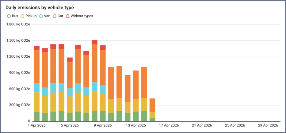
Click a chart segment to view the list of devices for the selected vehicle type and date, including device name, vehicle type, and total emissions. You can also go to the Scope 1 emissions report from the details.
-
Emissions trend (line chart): Visualizes total CO2e emissions over the selected time period as a line chart. If necessary, use the Show previous period toggle to display a comparison line for the previous period. This helps track progress toward emissions reduction targets and identify seasonal patterns or anomalies.
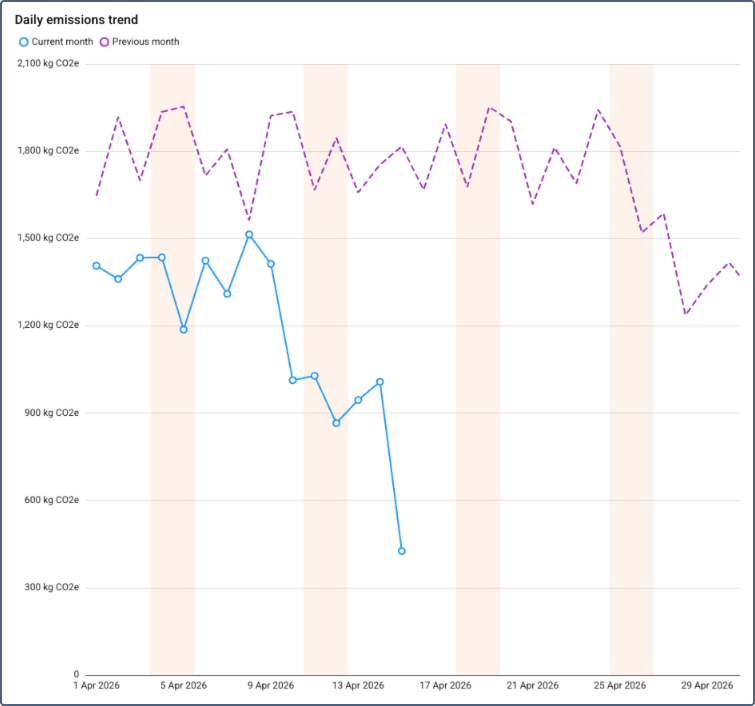
Click a chart point to view the list of devices and their total emissions for the selected date. You can also go to the Scope 1 emissions report from the details.
-
Total fleet emissions (value card): Displays the total CO2e emissions for the fleet over the chosen time period. If necessary, use the Show difference between previous periods toggle to display a comparison with the previous period as a percentage. This provides a key performance indicator for compliance reporting and tracking the overall environmental impact of the fleet.
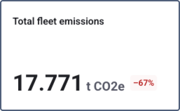
Click the widget to view the list of devices and their total emissions for the selected period. You can also go to the Scope 1 emissions report from the details.
-
Top devices by emission (list): Shows devices ranked by their CO2e emission values for the selected time period. Each device is displayed with a progress bar scaled relative to the highest-emitting device and the actual emission value in kg CO2e. If necessary, use the Show difference between previous periods toggle to display a comparison with the previous period as a percentage. The customer can sort the list in ascending or descending order.
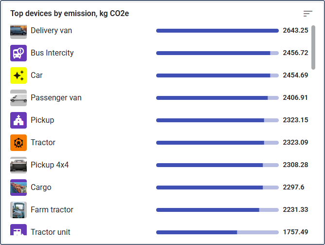
Click a device in the list to view its detailed emissions breakdown, including fuel type, fuel consumed, distance, and total emissions. You can also go to the Scope 1 emissions report from the details.
In all widget details views, you can sort the data by clicking a column header and download it in CSV format using the export button.
All emissions widgets respond to the analysis period selected at the top of the Dashboard page.