Configuring app branding
Who can do it: Service provider
Where: Wialon Platform Studio
App branding defines how a white-labeled app looks to your customers: the app icon on the device, the logo on the login and splash screens, and the accent colors throughout the interface.
The branding settings are the same for the Driver app and the FleetSpace app. Configure them in the App branding section of each build on the Sites and apps page.
Setting up branding
To configure the app branding:
-
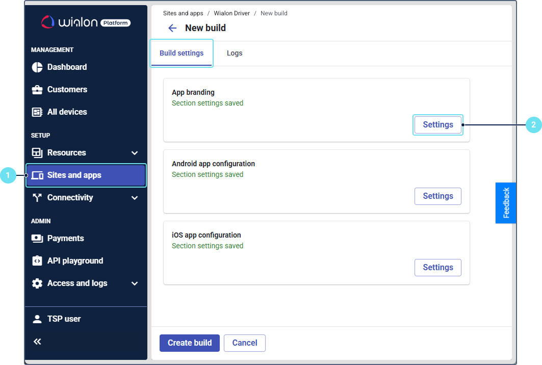
On the Sites and apps page, go to the Driver app or FleetSpace app tab and click New build. On the FleetSpace app tab, select New in the dropdown list.
-
On the Build settings tab, click Settings next to App branding.
-
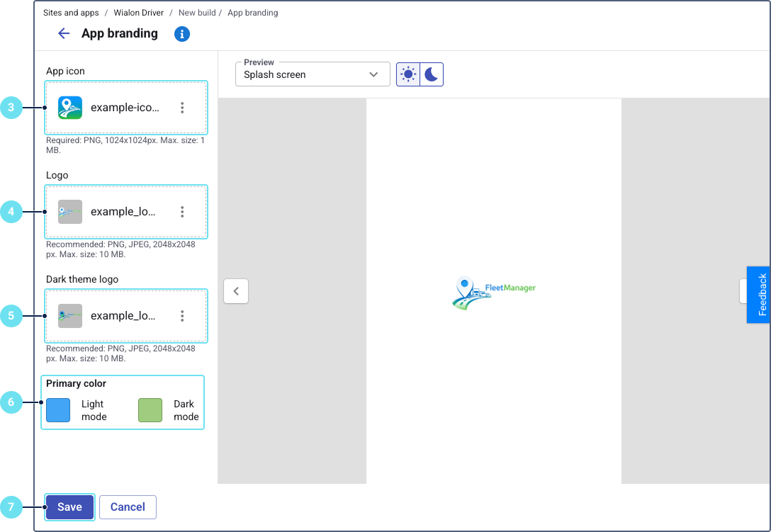
Upload the app icon. It’s displayed on the device home screen.
- Format: PNG only
- Resolution: 1024×1024 pixels
- Maximum file size: 1 MB
-
Upload the logo for the light mode. It’s displayed on the splash screen and login page in the light mode.
- Format: PNG or JPEG
- Resolution: 2048×2048 pixels
- Maximum file size: 10 MB
-
Optionally, upload the logo for the dark mode. If you don’t upload it, the light mode logo is used.
-
Set the primary color for the light and dark modes using the color picker. The primary color is applied to buttons, active elements, and other accented interface components.
-
Click Save.
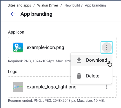
To download or delete an uploaded image, click the icon  next to the file name and select Download or Delete.
Previewing the result
The Preview area on the right side of the page shows how your branding looks in the app. Use the arrow buttons or the drop-down list to switch between the preview screens.
The set of screens depends on the app type.
Driver app preview
| Screen | Description |
|---|---|
| Splash Screen | The loading screen displayed when the app opens. |
| Login Screen | The login page with the phone number and password fields. |
| Assigned checklists | The list of checklists assigned to the driver. |
| Submitted checklists | The list of checklists the driver has submitted. |
| Components | Common interface elements (buttons, chips, checkboxes, radio buttons, tabs, text fields, alerts) with your theme colors applied. |
FleetSpace app preview
| Screen | Description |
|---|---|
| Splash Screen | The loading screen displayed when the app opens. |
| Login Screen | The login page with your logo. |
| Devices | The list of devices. |
| Device | The details of a selected device. |
| Notifications | The list of notifications. |
| Settings | The user settings on the More tab. |
| Components | Common interface elements (buttons, chips, checkboxes, radio buttons, tabs, text fields, alerts) with your theme colors applied. |
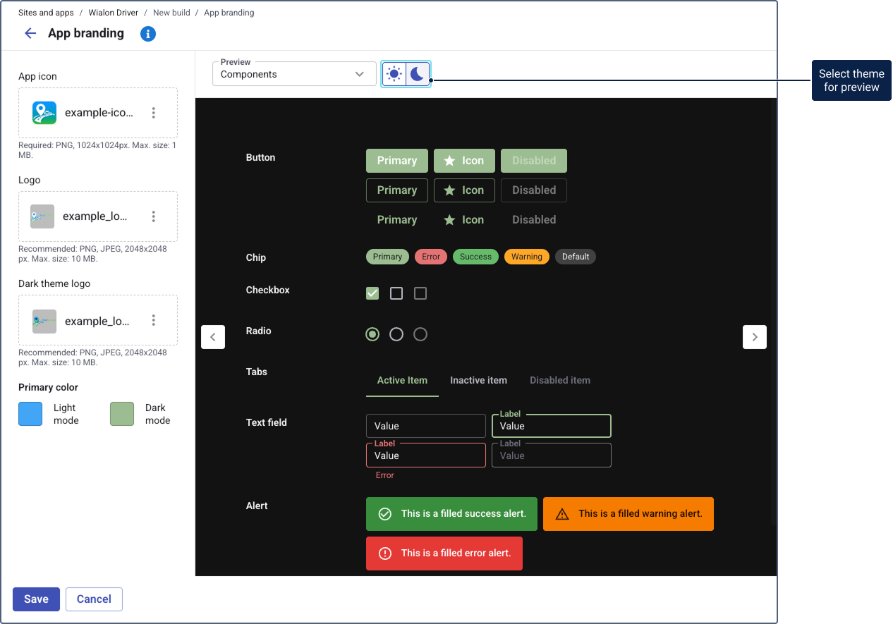
Use the light and dark mode buttons above the preview to check both modes.
The preview is used only to check the branding. The buttons and links in it aren’t active.
After saving the branding, return to the Build settings tab and proceed to the app configuration.
If you leave the build after saving only the branding (without the app configuration), no build row appears in the table. To continue configuring, click New build. The system loads the data from your last saved configuration.